How to Decorate Your Home with 2024 Color Trends
Just in time to ring in the New Year, the top paint manufacturers have unveiled their 2024 Color of the Year selections! While color experts from leading paint and design companies each name their own pick for what they expect to trend in design, there's definitely a consistent theme, with comforting, nurturing blue hues in-style for the new year.
For 2024, the color experts at Sherwin-Williams, the industry-leading paint brand used in our new construction homes in Florida, selected Upward as their 2024 Color of the Year. Sherwin-Williams also put together its Colormix® Forecast of curated color palettes that make it easy for you to pair different hues in your home design.
Are you wondering how to use this year’s trending interior paint colors? Join us as we dive into how to incorporate 2024 color trends into your home decor!
Sherwin-Williams Color of the Year
Upward (SW 6239) is a breezy, blissful blue that reminds us of a calm, cloud-kissed sky. This hue with its hint of a silver lining embodies the essence of peaceful moments, inviting a sense of clarity and serenity as it washes over your space. Described as “a sunny-day shade for spaces brimming with positive energy, creative thinking, and total contentment,” Upward promotes wellness and invites you to take a deep breath, slow down, and enjoy life’s moments.
Blue, as it turns out, is the most popular color in the world and there is a good reason why – it’s known as a calming, soothing tone, with a connection to nature whether that’s a blue sky or Caribbean waters. Upward, in particular, was selected for its neutral tone and versatility that makes it ideal for use in nearly any room in your home, or as an exterior paint color.
Use with Coordinating Colors and Materials
Blue has long been a popular paint color for coastal style and Florida home décor, and Upward is one of our favorite blue-grey paint colors as it is neutral enough to paint a whole room, or perfect to add a pop of color in the form of accent wall, painted wall paneling, or painted furniture. It pairs well with crisp black and white, warm woods, cool pastels, and other deep and dreamy shades:
- Sherwin-Williams suggests pairing with warm neutral paint colors such as Snowbound and Drift of Mist, dramatic dark options like Gale Force and Tricorn Black, or earthy green and brown shades including Palm Leaf and Antiquarian Brown.
- For a minimalistic look, use a monochromatic paint palette with other dreamy blue-grey tones.
- And, classic white creates a contrast that may either be crisp and clean, or soft and dreamy, depending on the tones and materials.
Speaking of materials – we love this color paired with textured white materials such as painted wall paneling or linen, warm-toned wood, and dark metal accents.
Use Upward as an exterior paint color on the body of your home with the simplistic contrast of blacks and whites for trim, shingles, shutters, light fixtures, and door hardware.
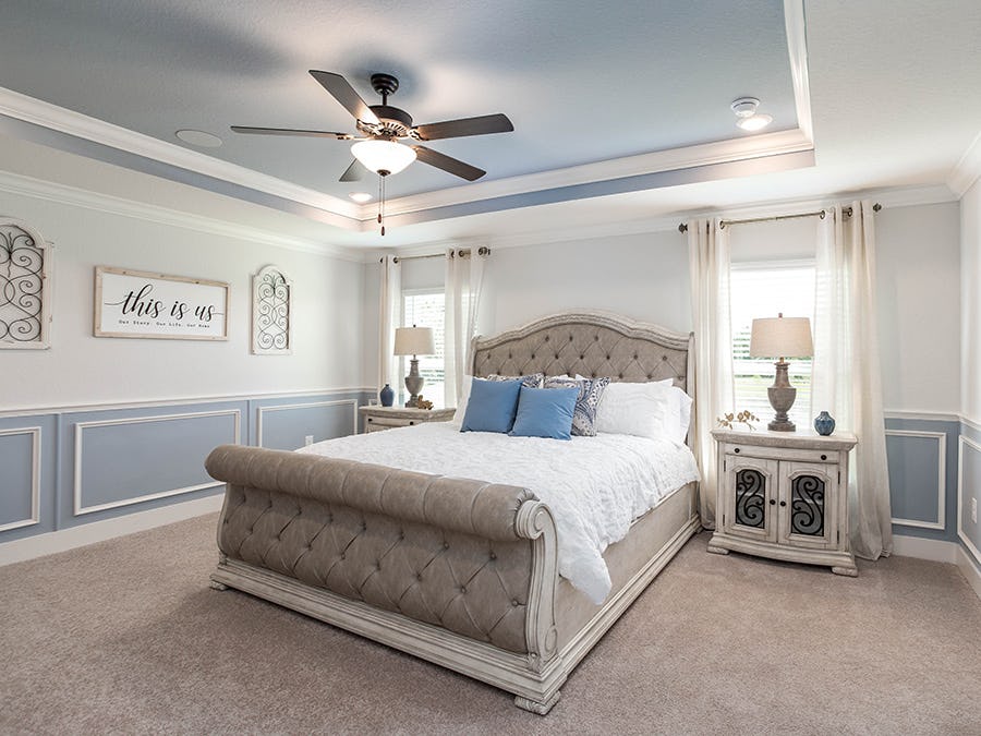
Design a Dreamy Bedroom
While Upward can be incorporated into any room, we particularly love using this interior paint color in bedrooms to evoke a serene dream space.

Stacey Antonakos-Perez, manager of the Highland Homes design center, says, “Upward reminds me of the sky. In one of our model homes, I created a vision of blue skies with fluffy clouds in an airplane-themed child’s bedroom. Paired with white and darker blue tones and whitewashed furniture, it came together perfectly, ready to both stimulate the imagination and fly you away to slumberland.”
This interior paint color works equally well in an owner’s suite, whether you paint all four walls, a tray ceiling, or an accent wall. Not ready to paint? Select serene blue blankets, rugs, and window coverings, instead.
Create a Spa-Inspired Space
Upward’s serene hue is an ideal color choice for spa-like relaxation. Incorporate this paint color on bathroom walls or cabinets, or if you don’t want to go all in with paint, decorate with accents such as towels and bath accessories featuring a pale silvery blue to create a spa experience at home.
Into yoga or another meditative practice? Consider painting the walls of your workout or Zen room in Upward to encourage relaxation and serenity as you work through your favorite flows. Might I add, it’s also the perfect color for an office to help keep calm and collected throughout the workday.
Dive Into Beach-Inspired Coastal Design
With the trendiness of Upward and other coastal blues for 2024, coastal style décor is expected to grow in popularity – which is no news to those of us who live in Florida, where beach-inspired colors and materials thrive in home décor!
It doesn’t get much easier than pairing Upward with creamy whites and coastal accents – Paint your walls with Upward interior paint, pair it with white painted trim and wall paneling, and add in coastal accents with materials such as woven rattan or jute, natural wood, and linen for the ultimate oceanside-inspired escape.
Sherwin-Williams’ Colormix® Forecast
The 2024 Colormix Forecast offers a new approach to color through curated color collections. This year’s forecast is the inaugural installment of Anthology, Sherwin-Williams’ new biennial color trend report that showcases four key color families: blues and greens, reds and purples, deeps and darks, and delicate tints.
“These color trends are poised to play a significant role in tomorrow’s designs,” said Sue Wadden, Sherwin-Williams Director of Color Marketing.
No. 1 Blues and Greens
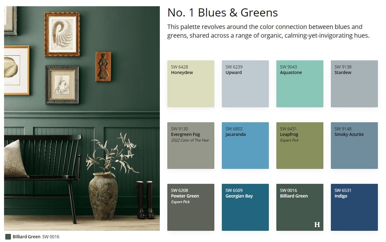
This earthy palette revolves around the connection between the calming yet invigorating hues of blues and greens. Inspired by natural influences, this palette includes both Upward and the 2022 Color of the Year, Evergreen Fog, along with hues ranging from the palest blues to the most vibrant greens.

These shades work well when paired with earth tones and warm neutrals, and can be used in almost every area of your home, from accent walls to exterior paint, kitchen cabinets to the front door.
No. 2 Reds and Purples
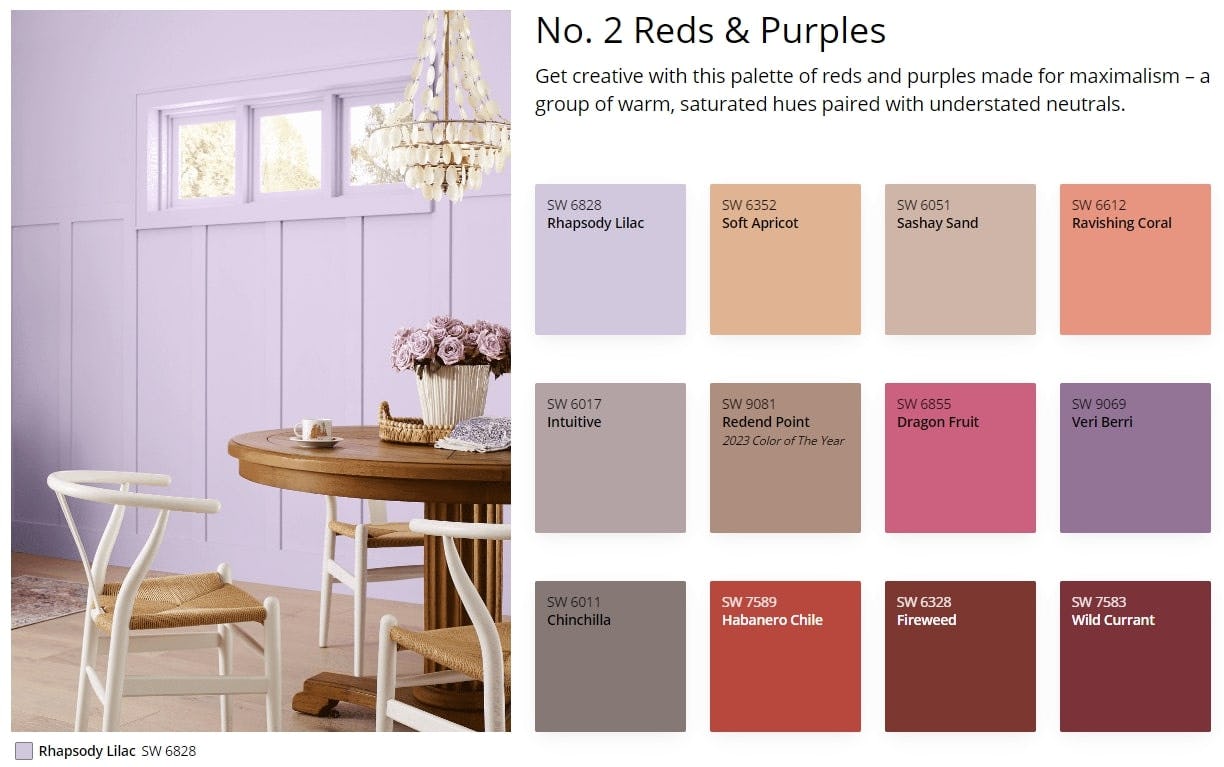
This maximalist palette inspires creativity and is curated with the bold in mind. Natural clay and mineral reds were popular color trends in 2023 and are expected to stay a trend in the coming years, and are joined here by colors inspired by fruit and flowers.
“These colors are vibrant and a little daring,” says Stacey. “I like to use these in girl’s nurseries and bedrooms to make a bold statement.”
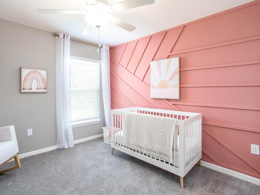
The warm, saturated hues in this collection pair well with understated neutrals like gray. For a bold splash of wall color, create an accent wall with trim work all painted the same shade, like we show above. For less dramatic and low-commitment decor, incorporate bold pops of color through accessories like pillows, blankets, and art.
No. 3 Deeps and Darks
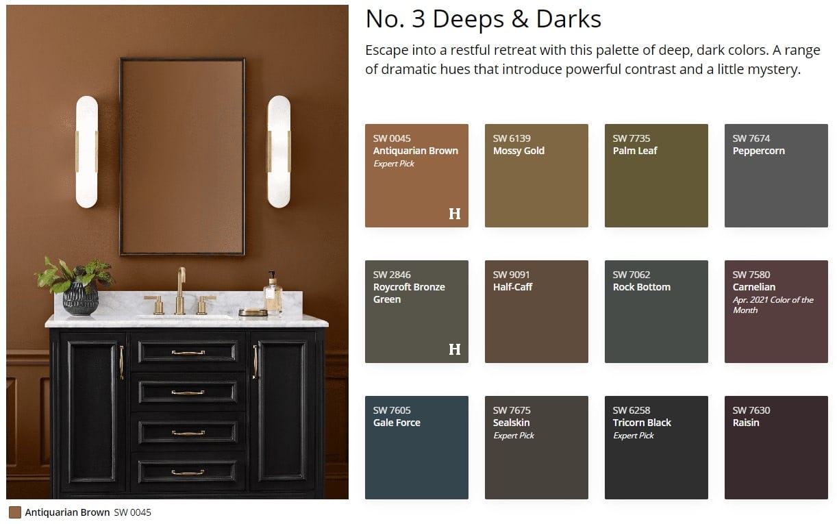
If rich were a color palette, this collection of shades would be the moneymaker. Featuring a range of dramatic deep tones, these colors introduce powerful contrast and inspire mystery, with warm browns and golds, rich greens, and elegant purples.
“This is my favorite color palette because I love contrast,” says Stacey. “Combined, they create a bold room design. Individually, they pair well with light colors and light woods, and we use a few of the colors in this palette for exterior paint accents and front door paint colors.”
These colors can be used in spaces large and small for dramatic effect. Paint a powder room or mudroom in one of these statement colors, or use this interior paint above wainscotting for an elegant touch in a hallway, dining room, or even a bedroom.
No. 4 Delicate Tints
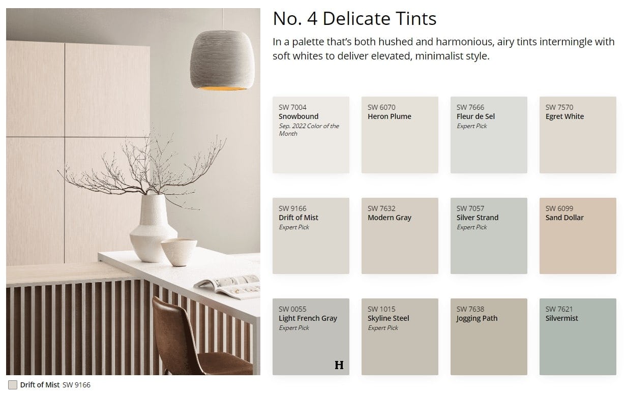
Created with the minimalist in mind, this grouping of airy tints mingled with soft whites provides an elevated, harmonious blend of neutral paint options that lends to a casual, boho, or sophisticated style.
“These colors are soft and comforting, and give your home a welcoming and open feel,” says Stacey. "I really like using one of these warm neutrals paired with a soft green like Silvermist, and gold accents.”
Designed to give your senses a break, these colors are ideal in any space in your home - likely, you'll pick one to use as the main paint throughout your home. The use of delicate tints encourages slowing down and enjoying life’s pleasures.
More 2024 Colors of the Year
Sherwin-Williams isn’t the only paint company to recently announce a Color of the Year – as noted in the intro, 2024 color picks strongly trend towards blues, along with uplifting, nature-inspired warm hues and green tones:
- Benjamin Moore Blue Nova, a dynamic and cosmic blue-violet
- Valspar Renew Blue, a balanced blue-green inspired by glacier lakes
- HGTV Home by Sherwin-Williams Persimmon, a warm and earthy terracotta
- Dutch Boy Paints Ironside, a deep olive
- Graham & Brown Viridis, a muted, mossy green
- Behr Cracked Pepper, a bold yet soft black (think very dark grey)
And it’s not just paint manufacturers...
Pantone 2024 Color of the Year
The Pantone Color Institute is globally recognized as a leading source of color expertise and Pantone’s annual Color of the Year influences fashion, arts, home décor, and more. This year’s selection, Peach Fuzz (13-1023), is a soft yet vibrant peach tone designed to nurture and help us find comfort and togetherness, creating a welcoming ambiance. The color can be used as a wall color, though we prefer it as a color accent in accessories, linens, wallpaper, and artwork.
Design Your Florida New Home with the Best Interior Paint Colors
Looking for more inspiration on using 2024’s top paint colors in your home décor? Browse our 2024 Colors of the Year Pinterest Board for a showcase of different décor and design ideas centered around these trending colors, and visit our online Inspiration Gallery to see a wide array of décor and design ideas for your new home.
There’s no better way to make your dream home design come to life than by building a new construction home in Florida! At Highland Homes, our building process allows you to shape your dream home alongside professional design experts at the Highland Homes Personal Selection Studio. Our designers help you choose from a spectrum of included features and luxury upgrades – they’ll even help you decide how to use Upward or Sherwin-Williams’ Colormix palettes in your interior design!
To learn more, browse our Florida new home communities and call or email us to connect with a Florida New Home Specialist today!
Tags: Inspiration Gallery Color of the Year Decorating tips Design trends Home decor Interior design Paint colors Personalize your dream home Personal Selection Studio
 Equal Housing