How to Decorate Your Home with 2027 Color Trends
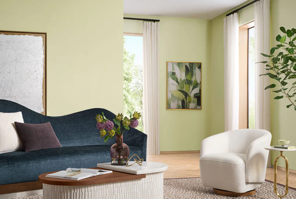
October just may be our favorite time of the year. Not only do Autumn’s cooler breezes bring pumpkin patches and fall festivals, but it’s the time of year when we get to talk about one of our favorite things – Color of the Year selections!
Each year, top paint manufacturers and design companies announce the colors they expect to trend in the upcoming year. 2027 color trends point toward nature - think herbal and mossy greens, sunbaked earth tones, and softened, smoky blues.
The color experts at Sherwin-Williams, the industry-leading paint brand used in our new construction homes in Florida, selected Celery (SW 6421) as their 2027 Color of the Year. Sherwin-Williams also put together its Colormix® Trend Forecast of handpicked hues they expect to trend in 2027 home décor.
Wondering how to use this year’s trending interior paint colors? Join us as we dive into how to incorporate 2027 color trends into your home decor!
Sherwin-Williams 2027 Color of the Year
Celery (SW 6421) is an airy, herbal green that feels soft, organic, and grounded. With subtle yellow undertones, the color exudes clarity and comfort, and is described by Sherwin-Williams as “a quiet reset for the home.”
Light and bright, warm and cheery, this soft tone creates spaces that feel welcoming and thoughtfully lived in, bringing fresh perspectives, elegance, and energy to any space.
As a color, green is a calming shade, evoking tranquility and symbolizing nature, growth, health, renewal, and prosperity. With its yellow undertones, Celery also evokes optimism and creativity, and is described by Sherwin-Williams as a soft, muted green, striking the perfect balance between an airy pastel and a grounded herbal hue, balancing optimism and calm, making it an ultra-versatile choice for today’s homes.
Why Celery Works in Florida Home Decor
Celery works well in a Florida home because its soft green ties your interiors to the palms, live oaks, and lake views that surround so many Florida neighborhoods. Its yellow undertone brings warmth and sunshine inside, creating a welcoming ambiance, especially in open, light-filled spaces such as a gathering room or dining café.
Soft and approachable, Celery works both as a statement color and a warm neutral.
Use with Coordinating Colors and Materials
Celery pairs well with colors that enhance its soft, organic character – think soft neutrals, expressive jewel tones, and grounded, earthy hues. To kick off your home décor inspo, Sherwin-Williams put together the Curated Harmony palette, a collection of nine hues that perfectly pair with Celery.
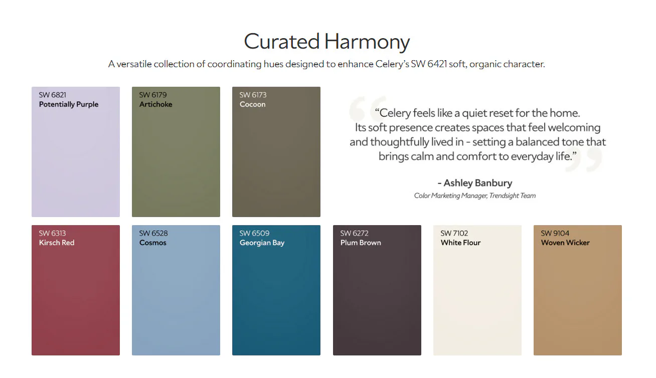
- White Flour (SW 7102), a warm, creamy white.
- Woven Wicker (SW 9104), a warm, golden tan neutral that keeps Celery grounded.
- Cocoon (SW 6173), an earthy brown with yellow undertones that pairs with Celery for a grounded look.
- Artichoke (SW 6179), a deep, natural green with yellow and grey undertones that creates a layered, tonal look alongside Celery.
- Plum Brown (SW 6272), a rich hue combining burgundy-purple with earthy espresso brown, for optimal contrast with Celery.
- Kirsch Red (SW 6313), a deep cherry with cool undertones that looks decadent with nature-inspired neutrals like Celery.
- Georgian Bay (SW 6509), a deep cerulean blue that adds a tranquil, coastal contrast.
- Cosmos (SW 6528), a dreamy, cool blue, perfect for creating a peaceful atmosphere.
- Potentially Purple (SW 6821), a playful violet most often used in a child’s room.
For materials, Celery looks its best next to warm and light wood tones, natural linen, and brushed brass or aged gold hardware.
Decorating With Celery, Room by Room
A Tranquil Bedroom
In a bedroom, Celery creates a calming and refreshing environment. It shines as an accent or the main color, so you can use it on all four walls, on a tray ceiling, or on an accent wall behind the bed. Pair it with White Flour trim and natural linen bedding for a calm retreat. A few deeper accents in Plum Brown or Artichoke, such as pillows, a bench, or a throw, keep the room from feeling flat.
A Fresh Kitchen and Dining Café
You can use Celery on the walls of your kitchen and dining café, or for painted furniture, shelving, or cabinets. The herbal tone feels at home near natural wood and white surfaces. You can also echo it with small details like linen napkins, ceramic serving pieces, or a bowl of fresh herbs on the island.
A Bathroom with a Spa Feel
Few rooms benefit from Celery’s calming yet vital nature more than a bathroom. Paint the walls, then let crisp white tile and warm wood cabinetry carry the rest of the room. For a lighter touch, Celery towels, bathmats, and a small potted plant deliver the same soothing effect without a paint project.
An Inspiring Home Office
Because this tone is both calming and inspiring, Celery is a mood-boosting choice for a home office. Georgian Bay or Artichoke on built-ins or shelving adds a little depth behind your desk while keeping the space restful and focused.
Nature-Inspired Outdoor Living Space
On a covered lanai or porch, outdoor textiles and planters are the easiest way to work in Celery. Look for outdoor cushions, an outdoor rug, or glazed ceramic pots in soft herbal greens. Layer in warm wood, woven textures, and plenty of real greenery to tie your outdoor living space to your interior palette.
Celery Without the Paintbrush
Not ready to commit to paint? Textiles, artwork, and accessories let you incorporate 2027 color trends into your home decor with no paintbrush required. Throw pillows, window treatments, area rugs, and ceramics in soft green give your rooms an instant refresh.
Sherwin-Williams 2027 Colormix® Forecast: Rewild
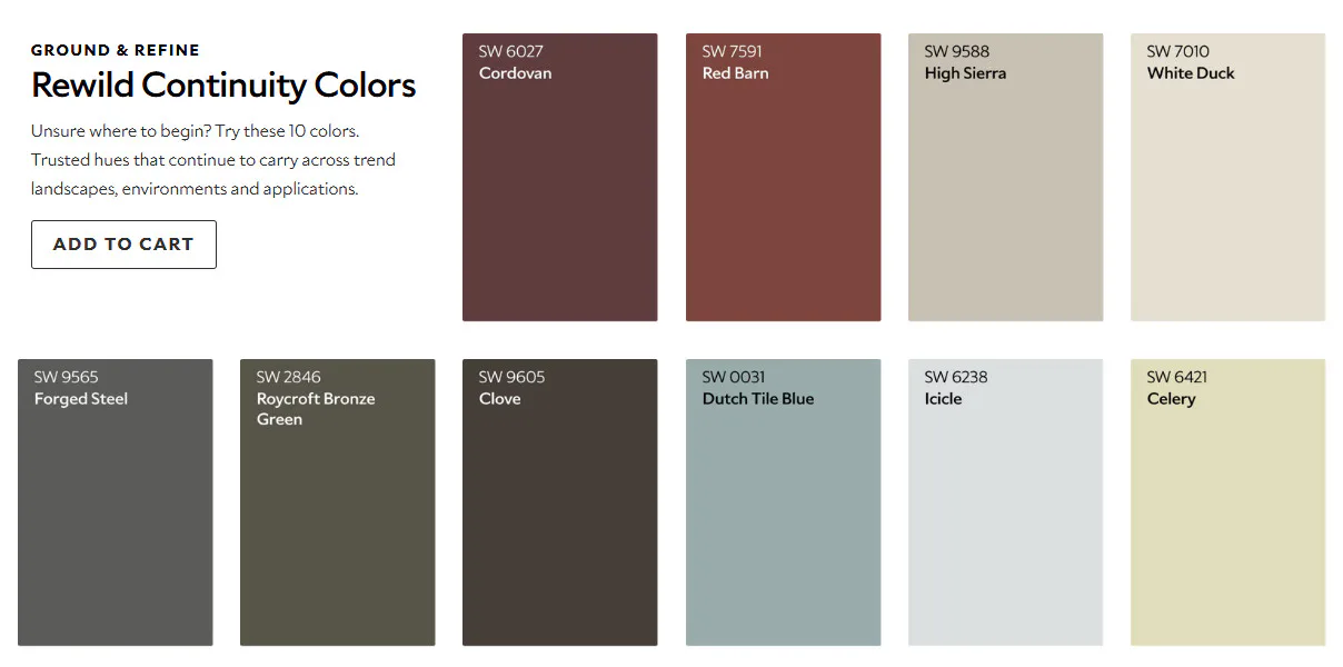
If you are looking for more trending interior paint colors beyond Celery, the Sherwin-Williams 2027 Colormix® Forecast provides additional on-trend colors sought after by designers. Called Rewild, this collection of 48 hues was curated by the Sherwin-Williams Trendsight Team to mix and layer in countless combinations. Unlike a palette offering a small selection of pre-curated colors, Rewild invites you to build a palette that feels personal to you.
Continuity Colors
Within Rewild, 10 shades are named as Continuity Colors. These are hues that endure and continue to be in-style, offering timeless paint colors for your home décor.
More 2027 Colors of the Year
Sherwin-Williams isn’t the only paint company to recently announce a 2027 Color of the Year:
- HGTV Home by Sherwin-Williams also named Celery its 2027 Color of the Year. This is the second year in a row that the brand has matched its parent company’s pick.
- Behr chose Grounded, a mossy olive green with earthy brown undertones.
- Glidden and Pittsburgh Paints chose Artifact, a smoky blue.
- Valspar chose Cottage Door, a grayed blue with warm undertones.
- Clark + Kensington, the Ace Hardware paint brand, chose Vantage Point, a softened blue.
- Dutch Boy chose Deep Rooted, an earthy orange.
- Dunn-Edwards chose French Press Coffee, a deep brown softened by a subtle plum undertone.
- C2 Paint chose Pueblo, a rosy, botanical shade.
- Graham & Brown chose Rose Earth, a warm earth tone inspired by the natural mineral pigments of Italian clay.
- Minwax chose Pickled Oak, a light, airy wood stain with gentle warm undertones that lets natural grain show through.
What Do the 2027 Colors of the Year Have in Common?
The 2027 Colors of the Year share clear trends: nature-inspired greens, deeper earthy warmth, and softened blues. Many brands also used the same language to explain their choices. Words like grounding, authenticity, calm, and intention appear again and again, and several brands built that theme directly into their color names, including Grounded, and Deep Rooted.
Nature-Inspired Greens Lead the Way
Green appears at both ends of the spectrum for 2027. Sherwin-Williams' Celery offers a light, herbal take, while Behr's Grounded delivers a deeper, mossy olive.
Earthy Warmth Grows Richer
Warm earth tones grew deeper and more expressive this year. Dutch Boy's Deep Rooted, Graham & Brown's Rose Earth, C2's Pueblo, and Dunn-Edwards' French Press Coffee all draw from clay, soil, and sunbaked landscapes. Together they offer cozy alternatives to the gray and beige neutrals of years past.
Blue Softens into Smoky Shades
Blue remains a favorite, and the 2027 versions are muted and grayed rather than bright. Glidden and Pittsburgh Paints' Artifact, Valspar's Cottage Door, and Clark+Kensington's Vantage Point all fall into this soft, smoky family. These versatile blues pair easily with white trim, natural wood, and the coastal décor so many Florida homeowners love.
Bring On-Trend Interior Paint Colors into Your New Florida Home
You can bring 2027 color trends into your new Florida home by choosing your palette as you build, so every finish works together from day one. When you build your dream home with Highland Homes, you will personalize your selections alongside professional designers at the Highland Homes Personal Selection Studio. They can help you decide where Celery, a Curated Harmony accent, or a Rewild hue will shine, and how each color works with your cabinets, countertops, and flooring.
.jpg?auto=format&q=50?fit=crop&w=900&h=675&auto=format&q=40)
For more inspiration, explore the Highland Homes Inspiration Gallery and our 2027 Colors of the Year Pinterest board, then browse Florida new home communities to find the place where your dream home and your 2027 palette will come to life.
Frequently Asked Questions About 2027 Color Trends
What is the 2027 Color of the Year?
The 2027 Color of the Year from Sherwin-Williams is Celery (SW 6421), an airy, herbal green with subtle yellow undertones. Other brands chose different colors for 2027, including Behr's Grounded, Glidden's Artifact, and Valspar's Cottage Door. Pantone and Benjamin Moore had not announced their 2027 selections as of early October 2026.
What colors go with Sherwin-Williams Celery?
The colors that go with Sherwin-Williams Celery include the nine hues in its Curated Harmony collection. Those hues are White Flour, Cocoon, Woven Wicker, Artichoke, Georgian Bay, Potentially Purple, Cosmos, Plum Brown, and Kirsch Red. Light neutrals like White Flour work best for trim and ceilings, while deeper shades like Plum Brown work best in small doses as accents.
Is Celery a warm or cool green?
Celery is a warm leaning green because of its subtle yellow undertones. The undertone keeps it from feeling icy, although the color will still look lighter and cooler in north facing rooms than in rooms that receive strong afternoon sun.
Is Celery a good paint color for a bedroom?
Celery is a good paint color for a bedroom because its soft, muted green creates a calm, restful atmosphere. It works on all four walls, on a tray ceiling, or on a single accent wall, and it pairs well with white trim, natural linen, and warm wood furniture.
What are the 2027 paint color trends?
The 2027 paint color trends are nature-inspired greens, rich earthy warm tones, and softened, smoky blues. Examples include Sherwin-Williams' Celery and Behr's Grounded for greens, Dutch Boy's Deep Rooted and Dunn-Edwards' French Press Coffee for warm tones, and Glidden's Artifact and Valspar's Cottage Door for blues.
How do I test a Color of the Year before painting a whole room?
To test a Color of the Year before painting a whole room, place a large sample on at least two walls and check it in morning, afternoon, and evening light. Most brands offer free color chips, peel and stick samples, or small paint samples, and colors with strong undertones can look noticeably different from one time of day to the next.
Tags: Color of the Year Decorating tips Design trends Home decor Interior design Paint colors Personalize your dream home


 Equal Housing